Telling a whole new story about Grandma’s cooking machine
What we liked most when working with erom team was their involvement in understanding what we needed. Each time they would deliver something, we knew how it would go beyond our own expectations.
Octavian Horj / Executive Director at Metalica
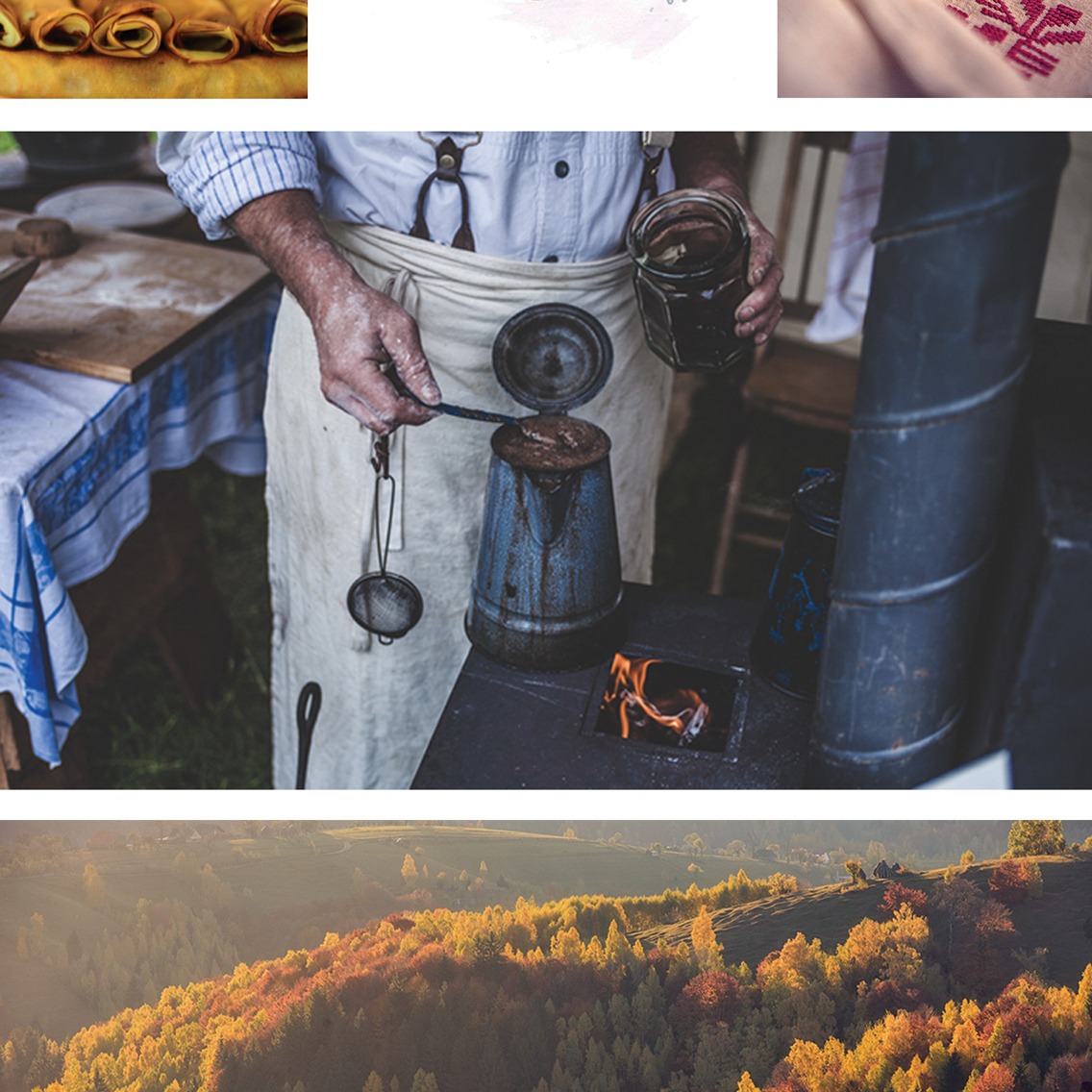
Lighting the fire
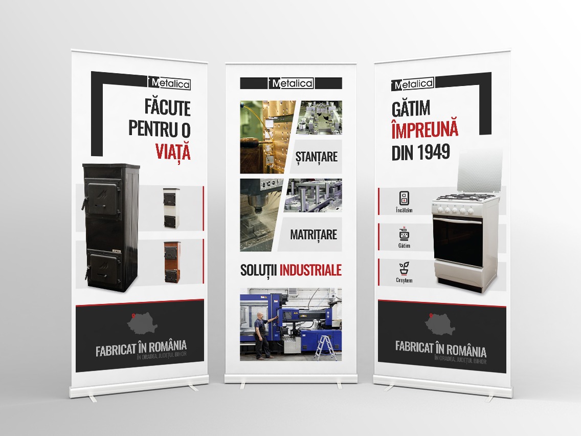
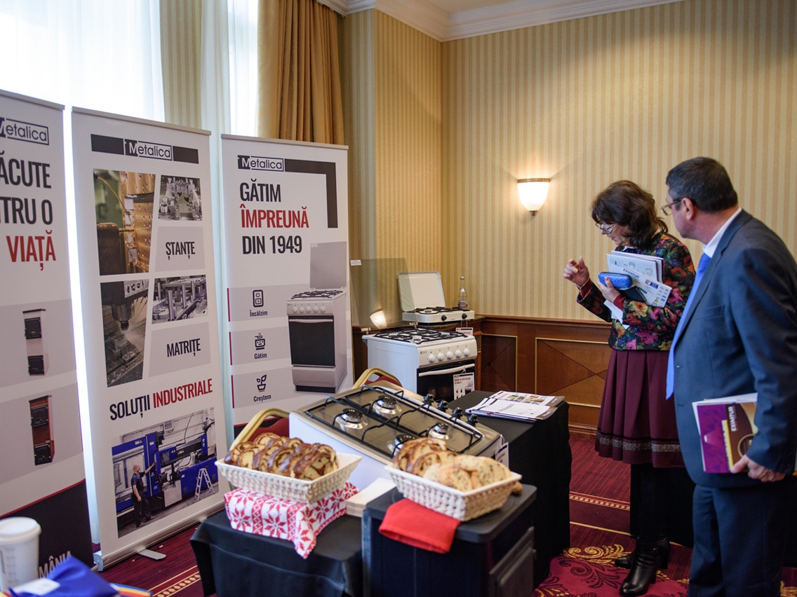
We first met the Metalica team before the branding phase, when they asked us to create three roll-ups they needed to display at a business fair. They, among others, were being celebrated and offered an award for the work they’ve been accomplishing in the past few years in the local landscape.
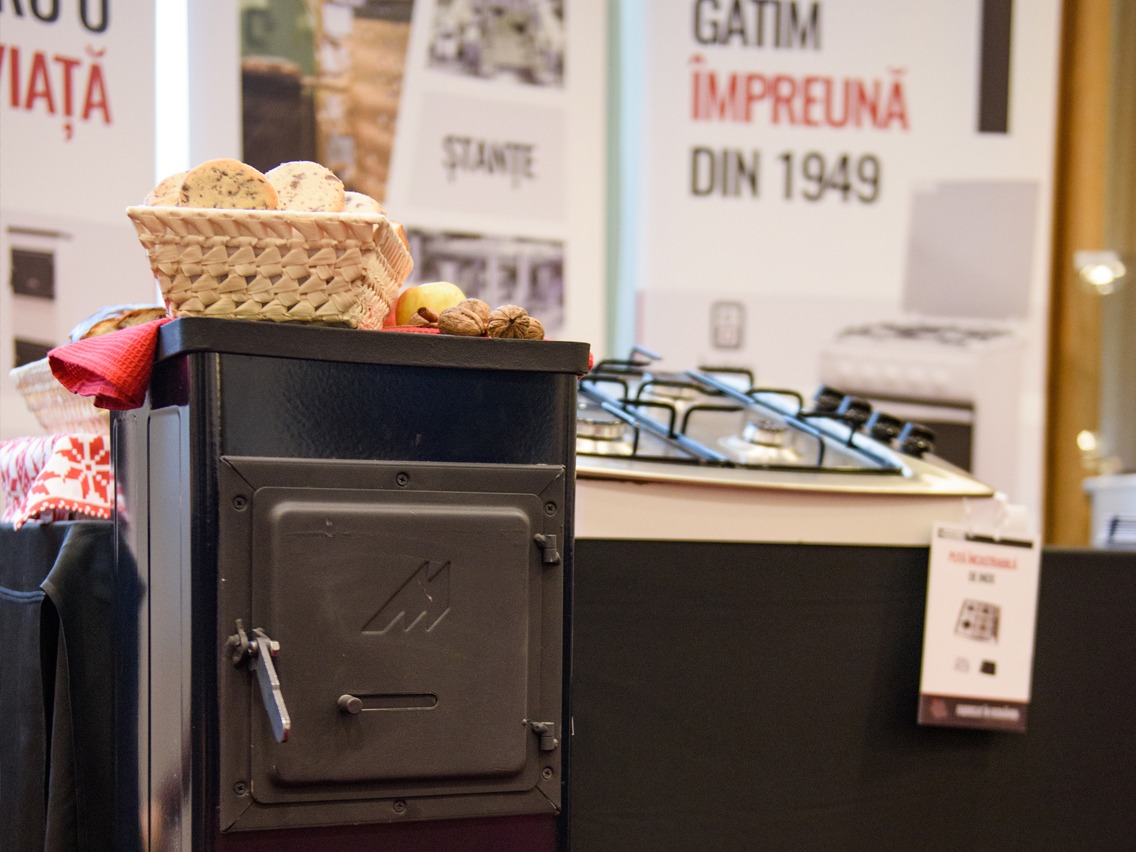
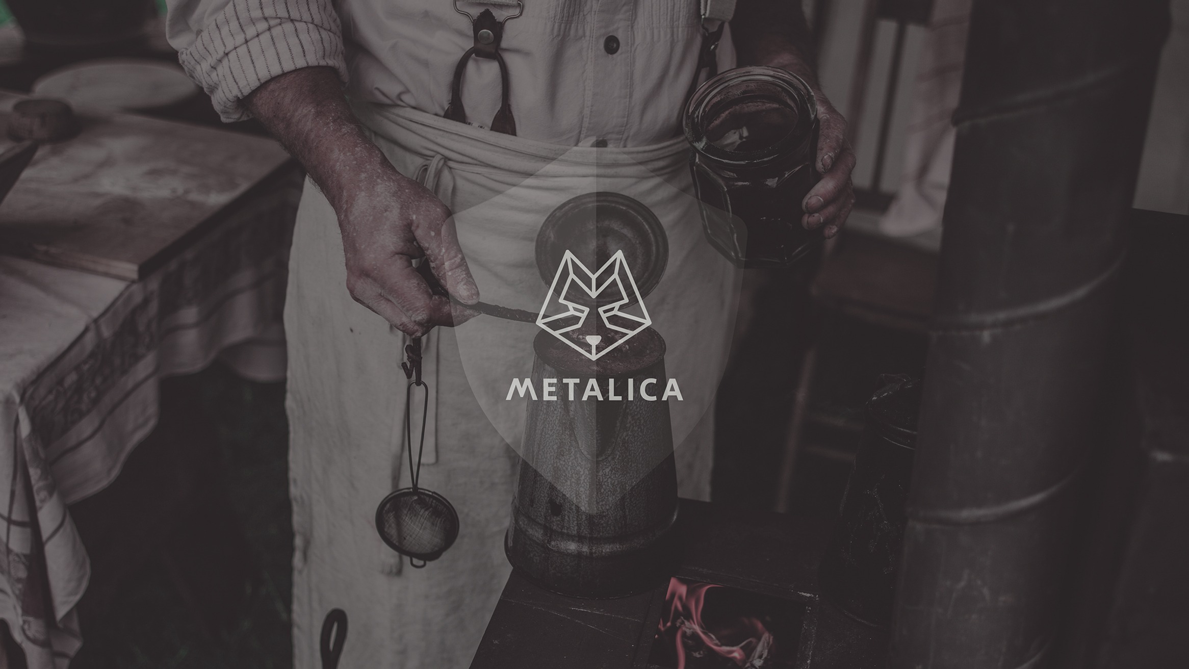
Metalica is a Romanian company that started producing stoves and cooking machines in the early ’50s. Their cooking machines were the most popular back then and amid the first ones to enter the kitchens in the countryside, replacing the old wood stoves with hobs on top.
Even today, their products use mostly parts made by themselves in their factory and with local materials. In this way, they make a considerable contribution to the growth of the local economy.
Branding memories
Hearing about Metalica cooking machines - the first thing crossing your mind is your childhood at your grandparent's place. How you were a kid and a day full of play would end up with grandma’s cookies and other homemade goodies. How a cold winter day could also be warm, thanks to the playing time spent outside in the snow which was more important than anything at that time, but also thanks to the short and always forced breaks when you’d enter the house and stand next to the stove, to warm yourself.
That and many others.
Yet, the company has been going through several changes after the ’90s, the business core and the visual brand as well. These changes required that the brand would once more define their vision while stepping into more current times.
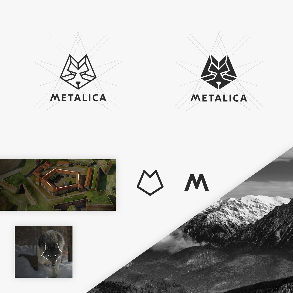
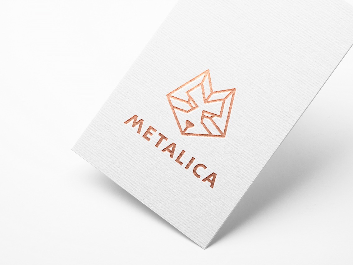
The image we’ve been building is a mix of these features: strong and imposing, familiar and lasting, traditional and local.
We used as the main symbol the wolf because it’s an animal that is often referred to in the old local myths and stories. It is a meaningful figure when it comes to this place’s origins.
We also integrated a local symbol for the company hometown Oradea, which is the pentagonal fortress - by using the pentagonal contour.
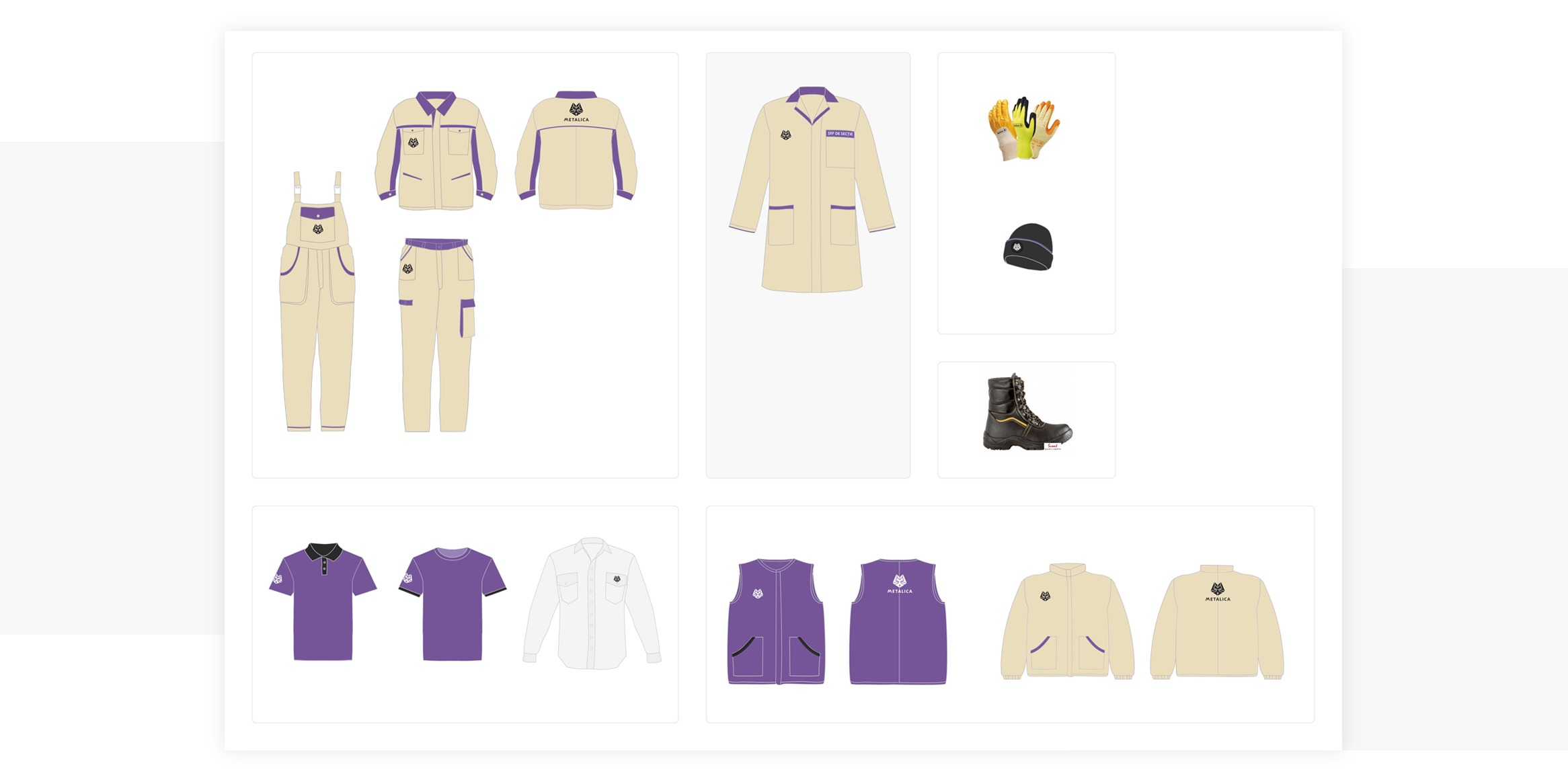
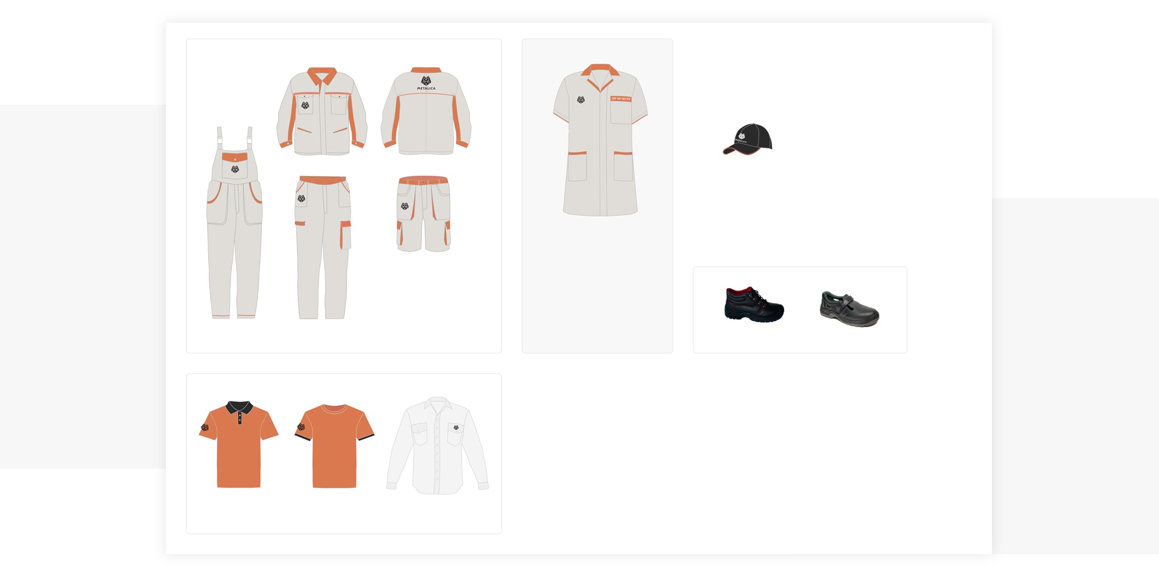
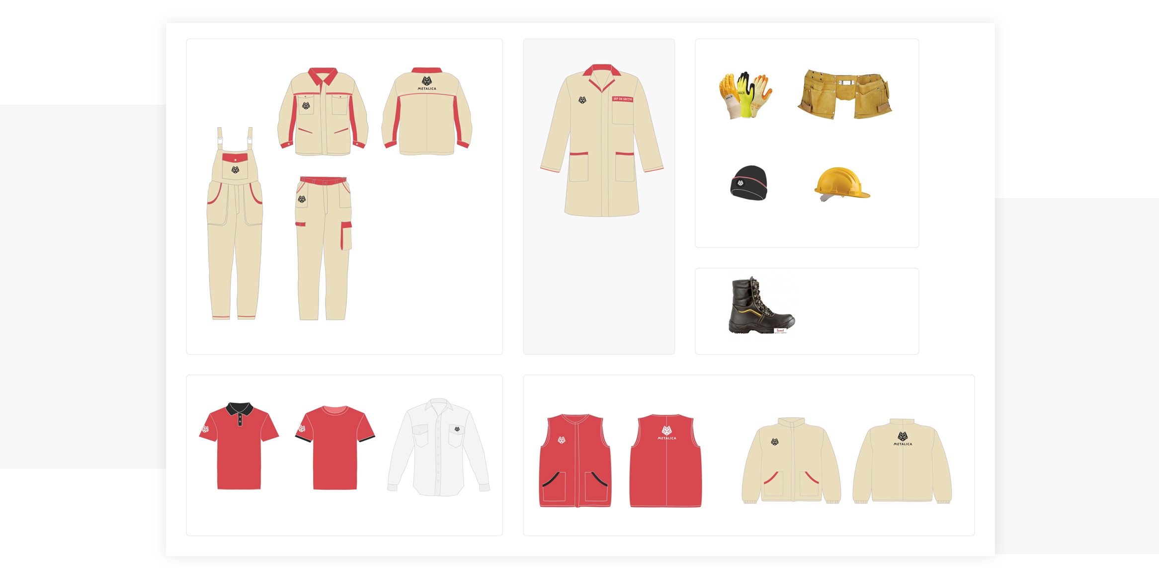
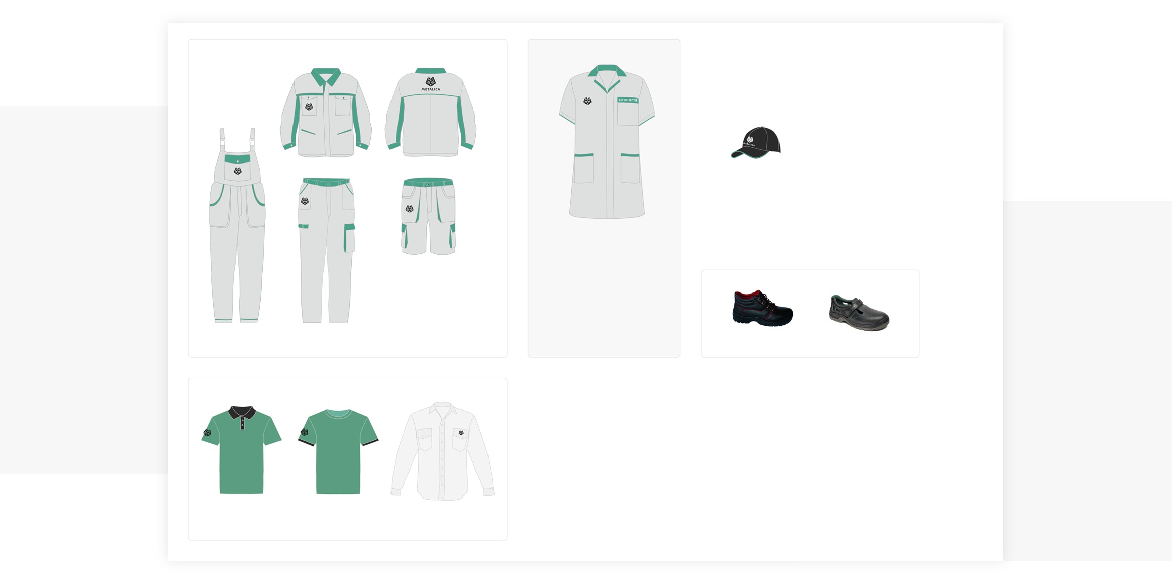
Designing the uniforms for the workers - that’s a whole new level of UX, the kind that one feels on his skin.
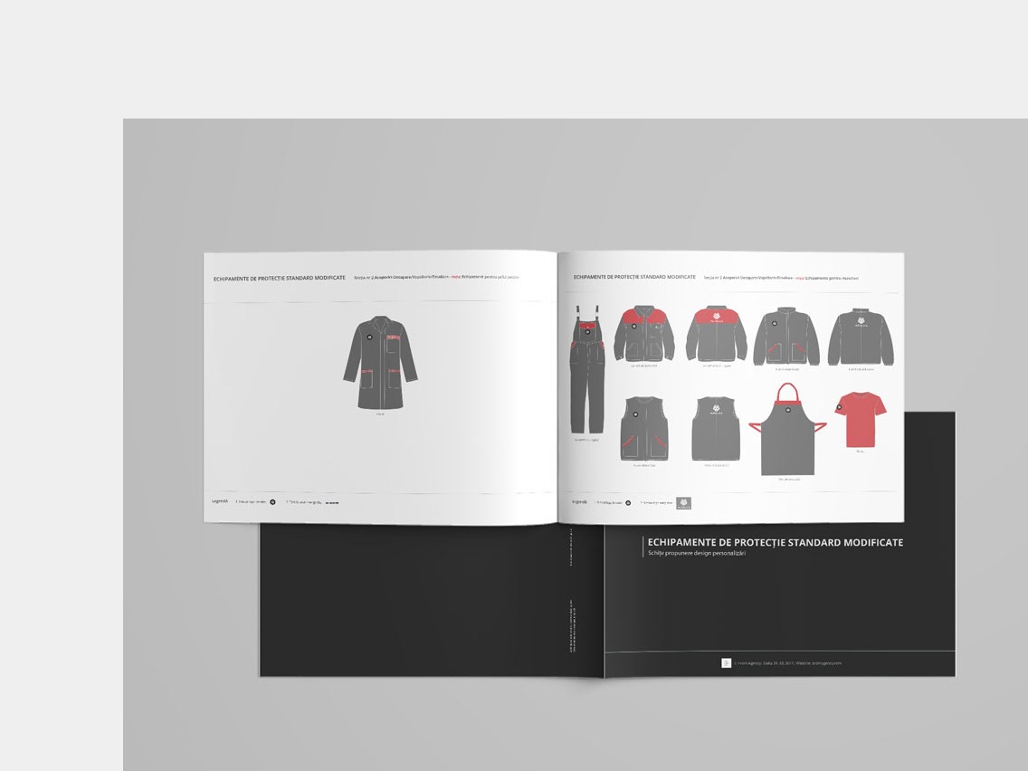
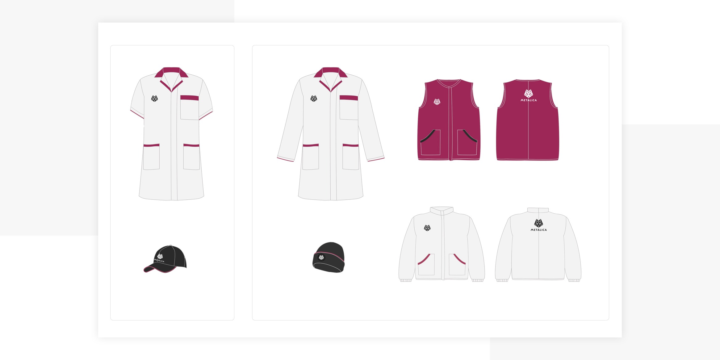
Designing for safety at work was a complex yet challenging phase of the branding process.
Not only it was something we would do at this level for the first time - because that was a factor of excitement. But the real challenge was designing models for the ten different factory sections while adding personalised features for each.
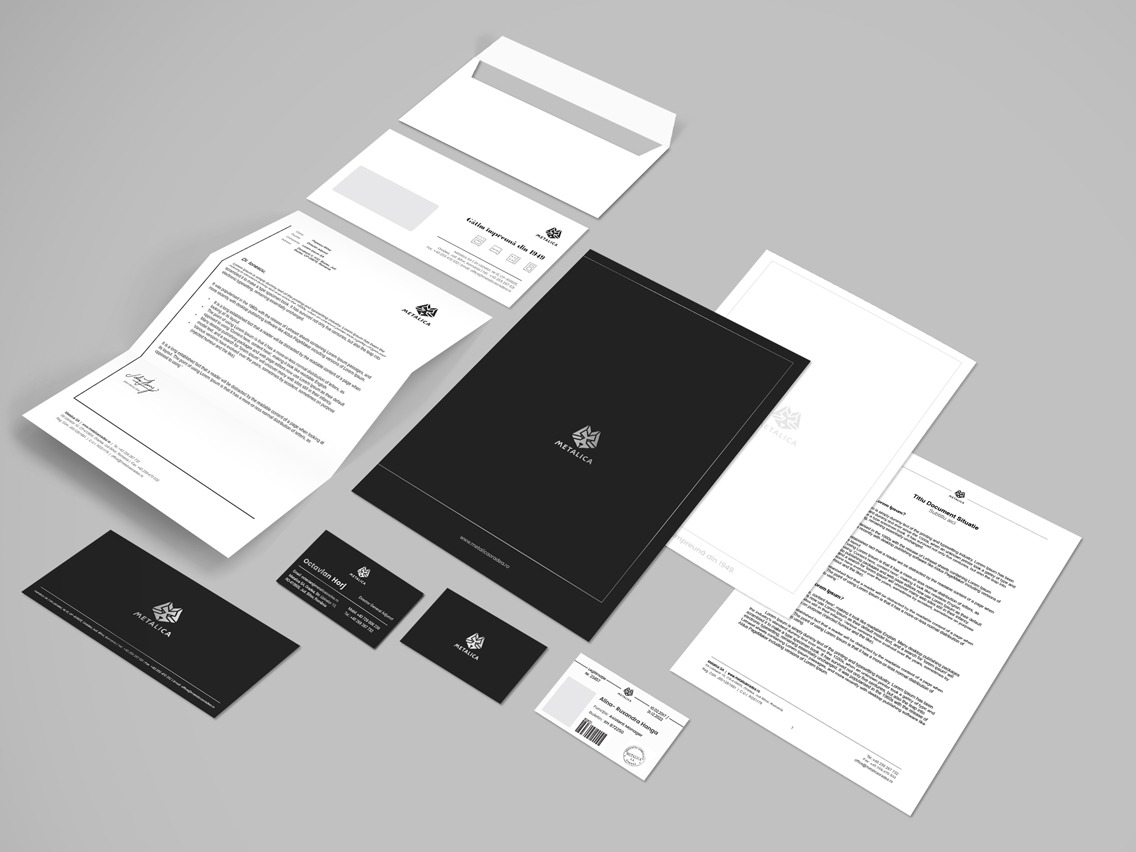
What did we deliver?
- One main logo and four secondary logos for the four main types of products.
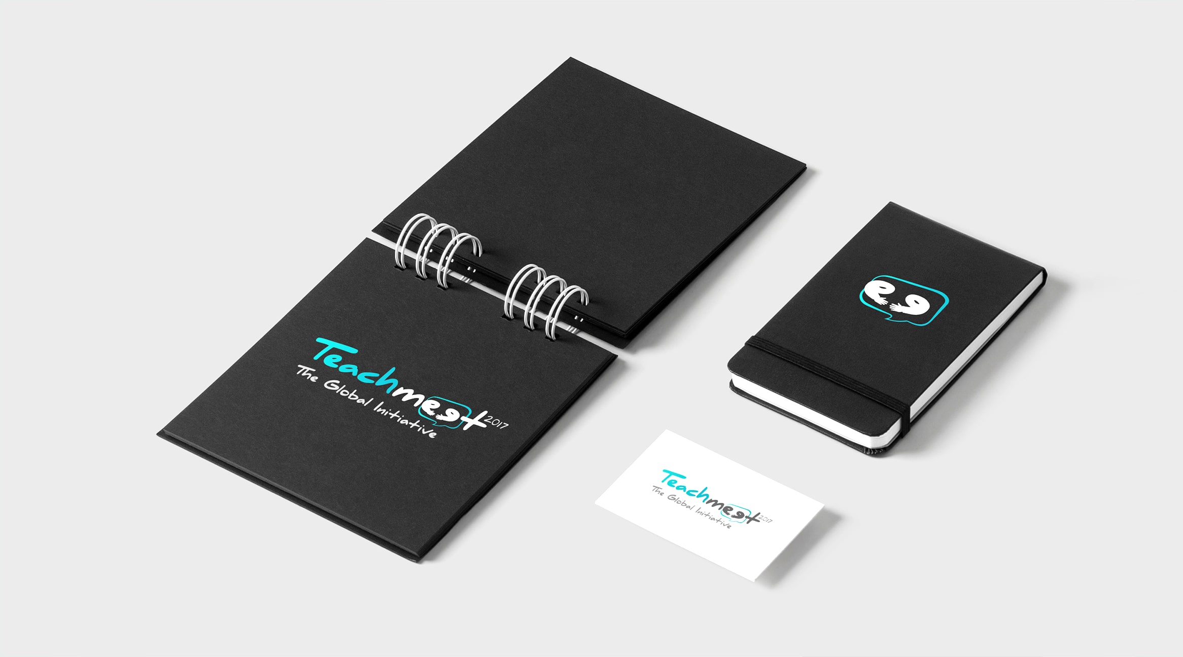
- Stationery items: business cards, letterheads, envelopes, badges, compliment slips.
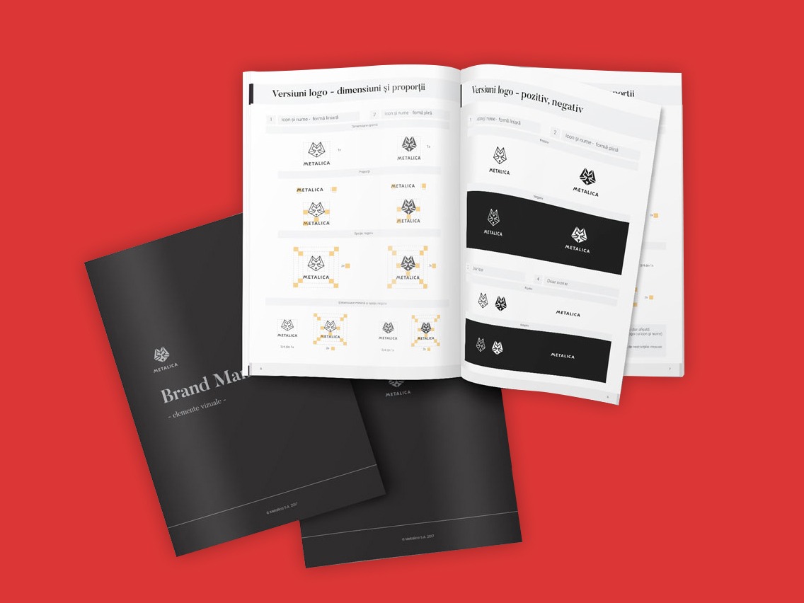
- Brand manual.
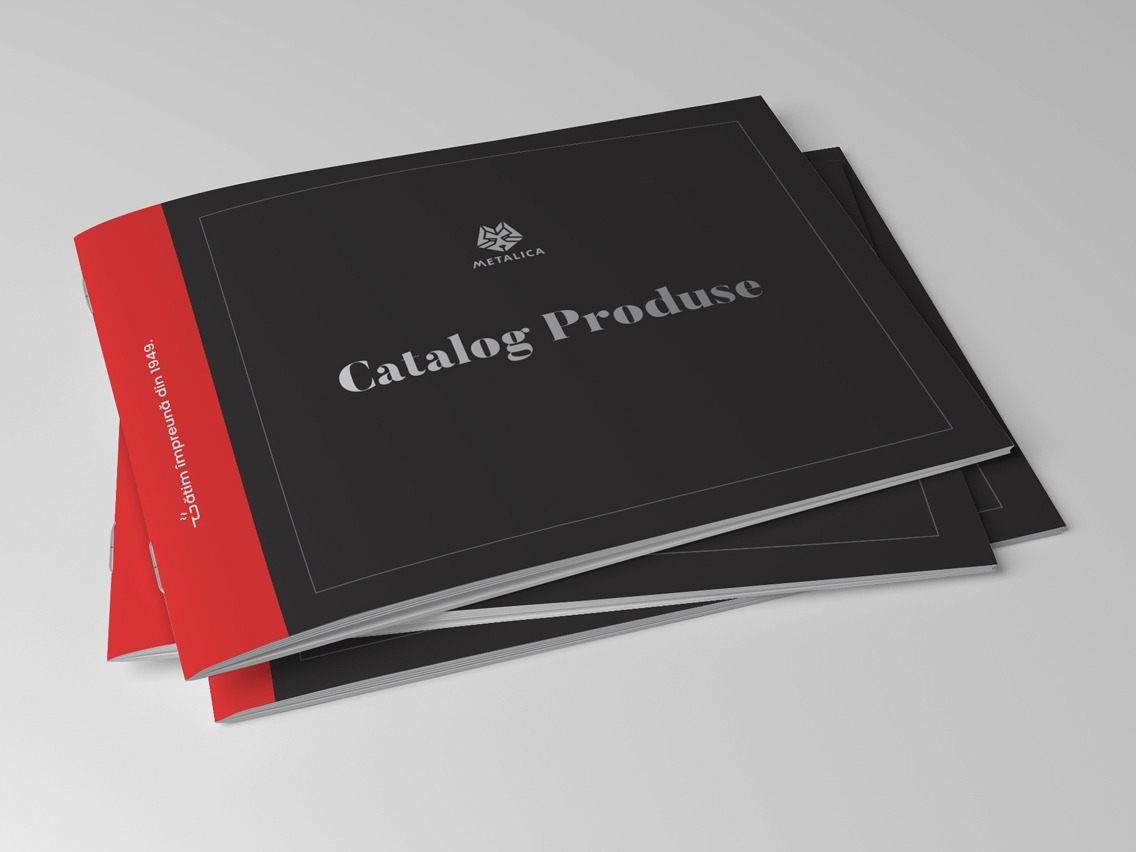
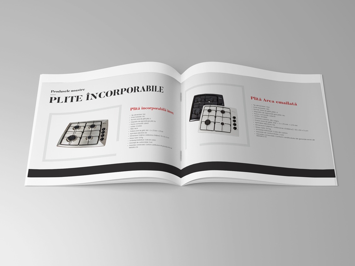
- Brochures: one for products and one for services.
- Uniform designs.
Further on, we continued teaming up with Metalica to create their new website.